Bring a Trailer is a great car auction website with a really unique business model, but their homepage could definitely use some tweaks. With these changes, my partner and I wanted more intuitive navigation, more relevant information displayed, and reduced clutter.
Research
After a few detailed user interviews, some user surveys, and in-depth competitor analysis, we determined that the website’s navigation needed a lot more clarity and simplicity. We also wanted to focus more on how Bring A Trailer differentiates itself from their competitors. The main things that made Bring A Trailer stand out were its emphasis on high quality, detailed photos, and its seller process and fees.
Design
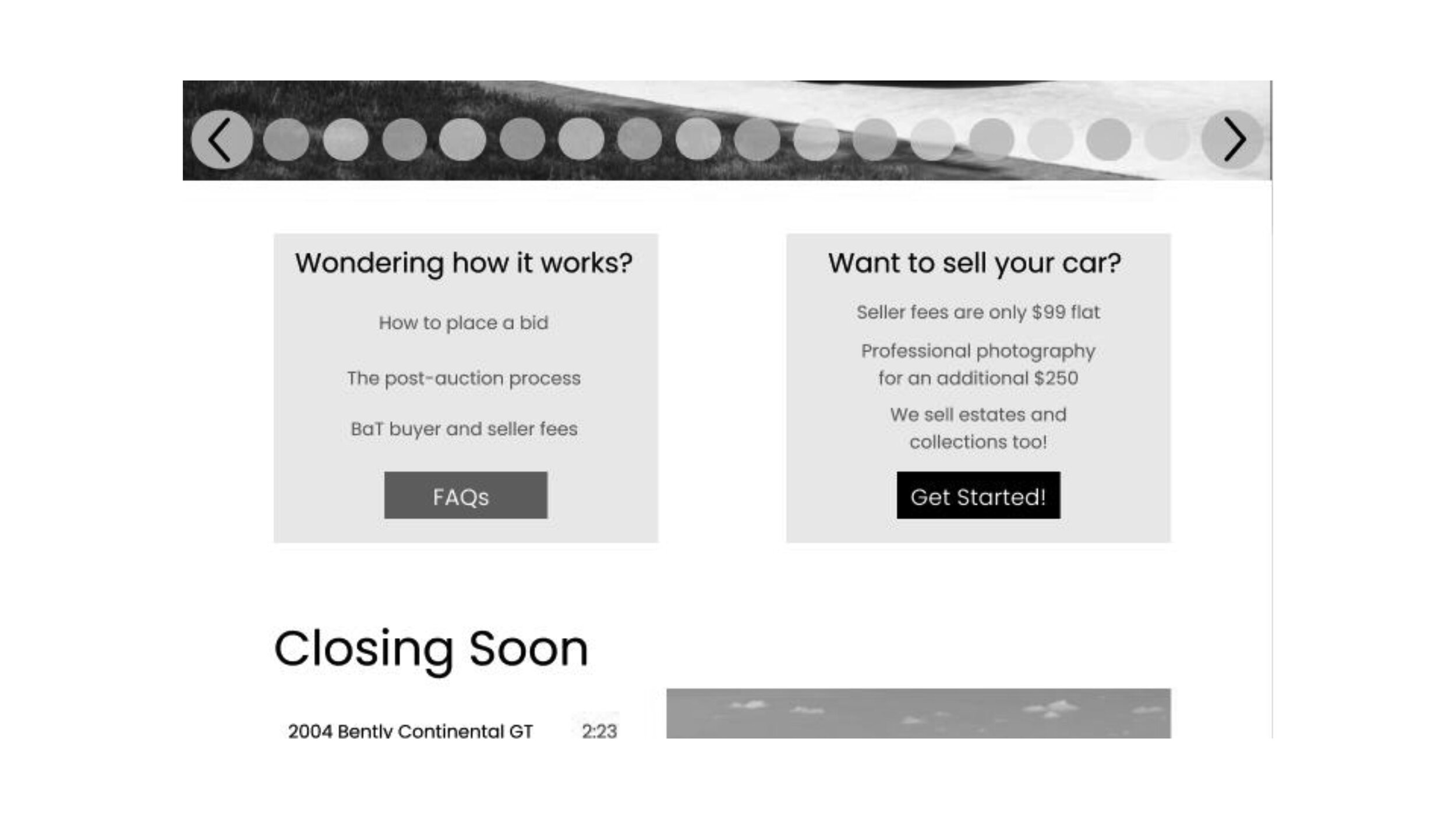
Because the goal of the redesign included putting an emphasis on the professional photography, we made sure that the scrolling auction bar at the top was very picture based.
We also wanted to give new users a place to go if they were unsure about buying from an online auction and add a section that gave first time sellers an idea of why they should sell with BAT.
Our users all voiced that the Latest Bids section didn’t really make sense, so we changed it to a Closing Soon section.
After scrolling past the header and latest bids sections, the website just continually scrolled past these Newest Listings that had paragraph-long descriptions. The problem was that users didn’t read these descriptions, the homepage ended up being 20+ scrolls, and it wasn’t labelled as a “Newest Listings” section.
Our solution to this problem was a three-tile approach with a Load More button at the bottom. This solves the problem of the home page being extremely long. We replaced the paragraph-long descriptions with a few key details of the car. Finally, we added the current price and the auction duration which were both missing from the previous site.
My partner and I agreed that their current footer wasn’t terrible, the only problem was that nobody ever saw it. The biggest change we made was to include larger social media links.
Overall this was a great learning experience in UI/UX. My partner and I both learned a lot about the flow of a website homepage and how to make it easier to navigate for users.


